-

Sarah Baran replied to the topic Cartoon/Manga Improvements? in the forum Art Critique 7 years, 12 months ago
@dekreel I have a lot of thoughts, so buckle down. 😉
First off, these are adorable! Love the style. You seem to have a pretty good grasp on body proportions (kudos to you—a lot of people struggle with bodies), and the costuming is great. I also love the eyes, particularly in the first pic. I think that guy has a lot of emotion in his expression.
Seems like you’re pretty aware of the main things that need improvement—ie, head size and side-views. I don’t think the problem is that the heads are too big, but that they’re too tall. If you shorten the portion above the eyes just a bit, it will make a tremendous difference.
Three-quarters view doesn’t seem too bad, but you’ve got the forehead sloping out instead of sloping in. That’s pretty easy to fix.
The side-view needs a bit more work:
- Firstly, the head is too tall, resulting in it looking extremely skinny. Shortening it just a bit, so the eyes are in the middle of the head, will help. (As a general rule, eyes should always be close to the middle of the face. Manga is a little different than the realistic stuff I’m used to, but that rule still mostly applies.)
- The mouth is too close to the bottom of the chin.
- The nose should have a more rounded slope…
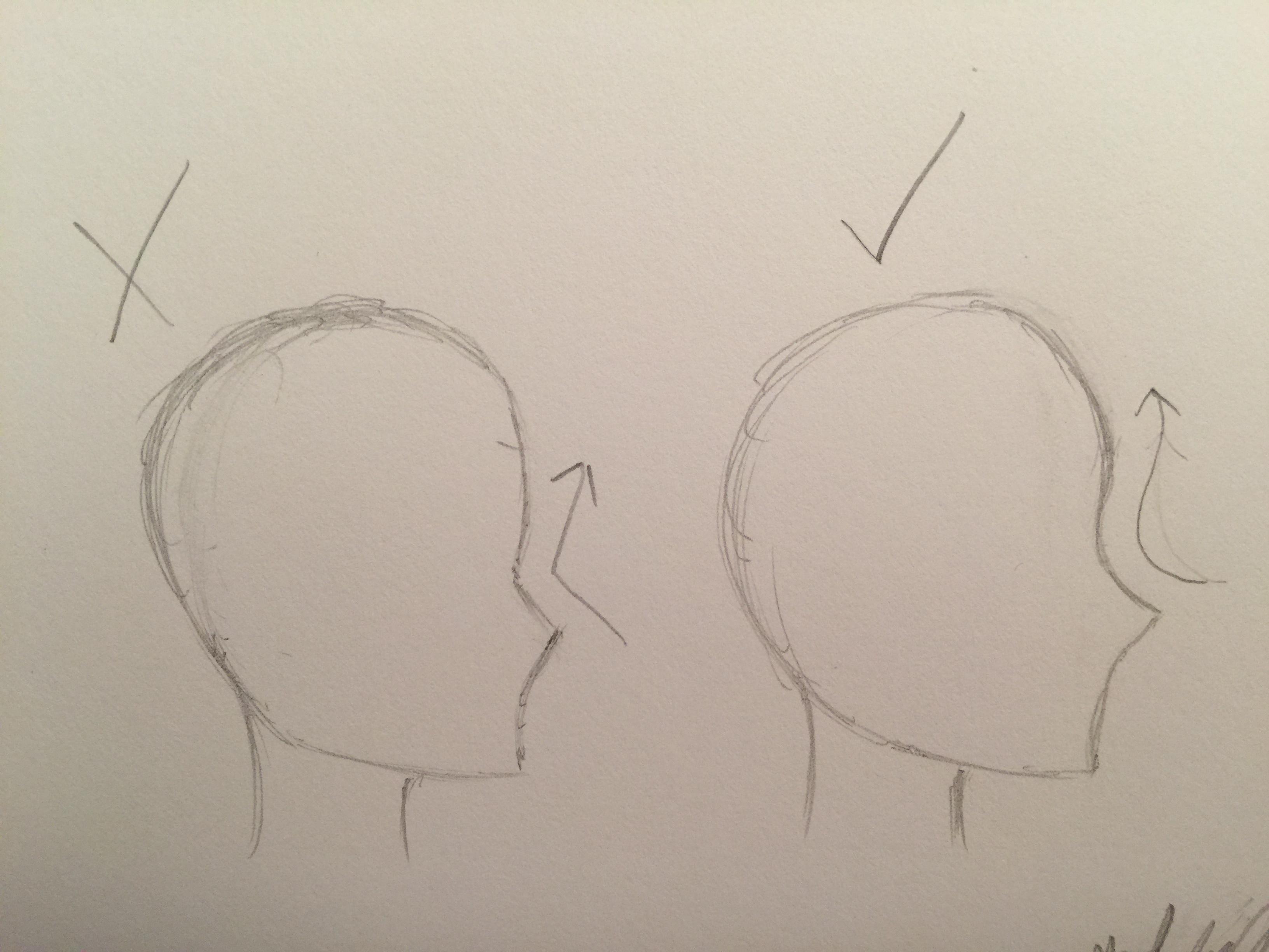
…like so.
Also, I would work at smoothing out hair texture. It seems a little scratchy.
And quick thing about shadows, which I really don’t know how else to explain other than this:
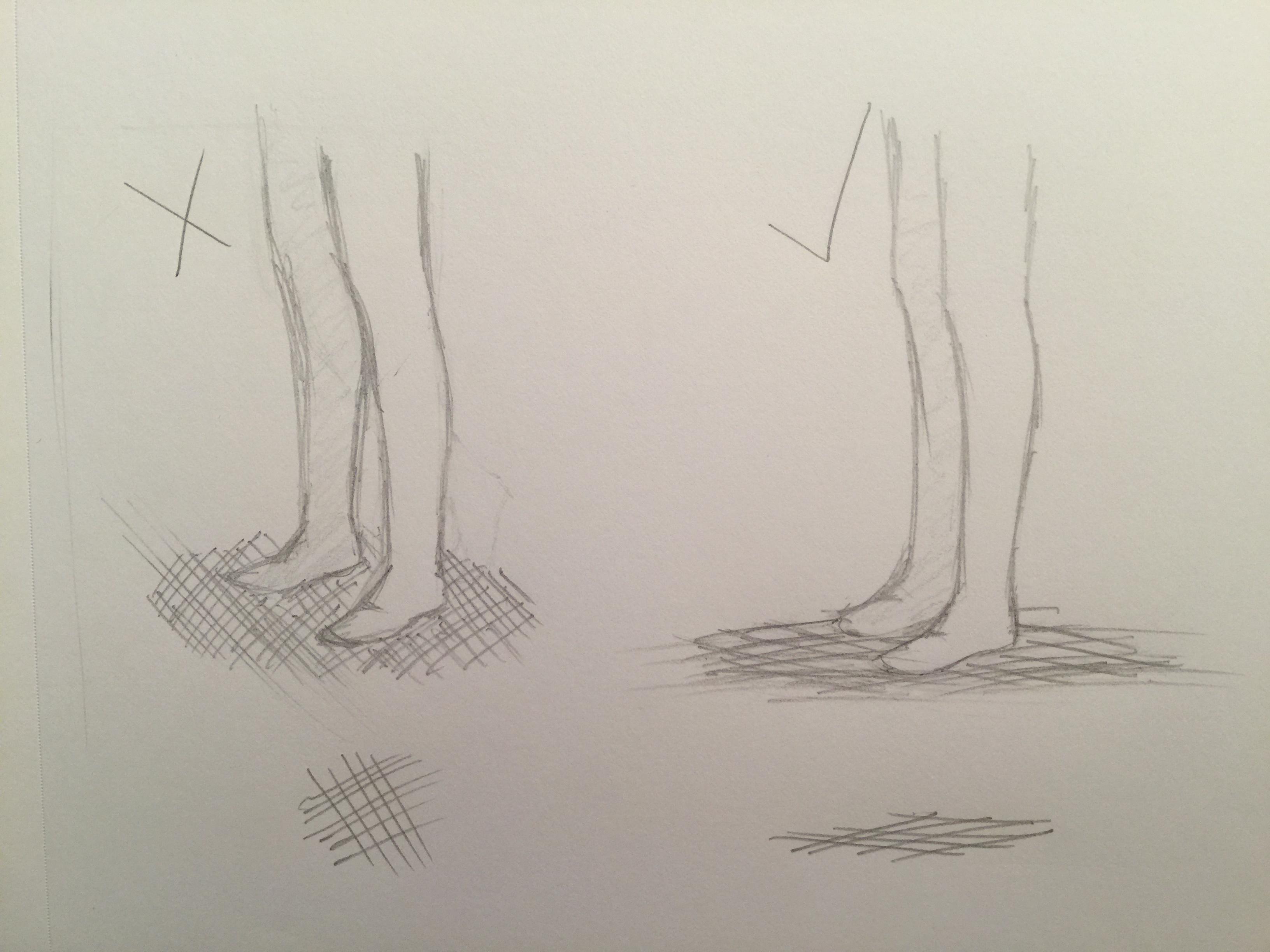
Do you see how that works?
Hope this helps. I’m gonna tag @Sarah-Inkdragon over here because she draws some fantastic manga and is more knowledgeable on the subject than I. 😏

Article Categories